
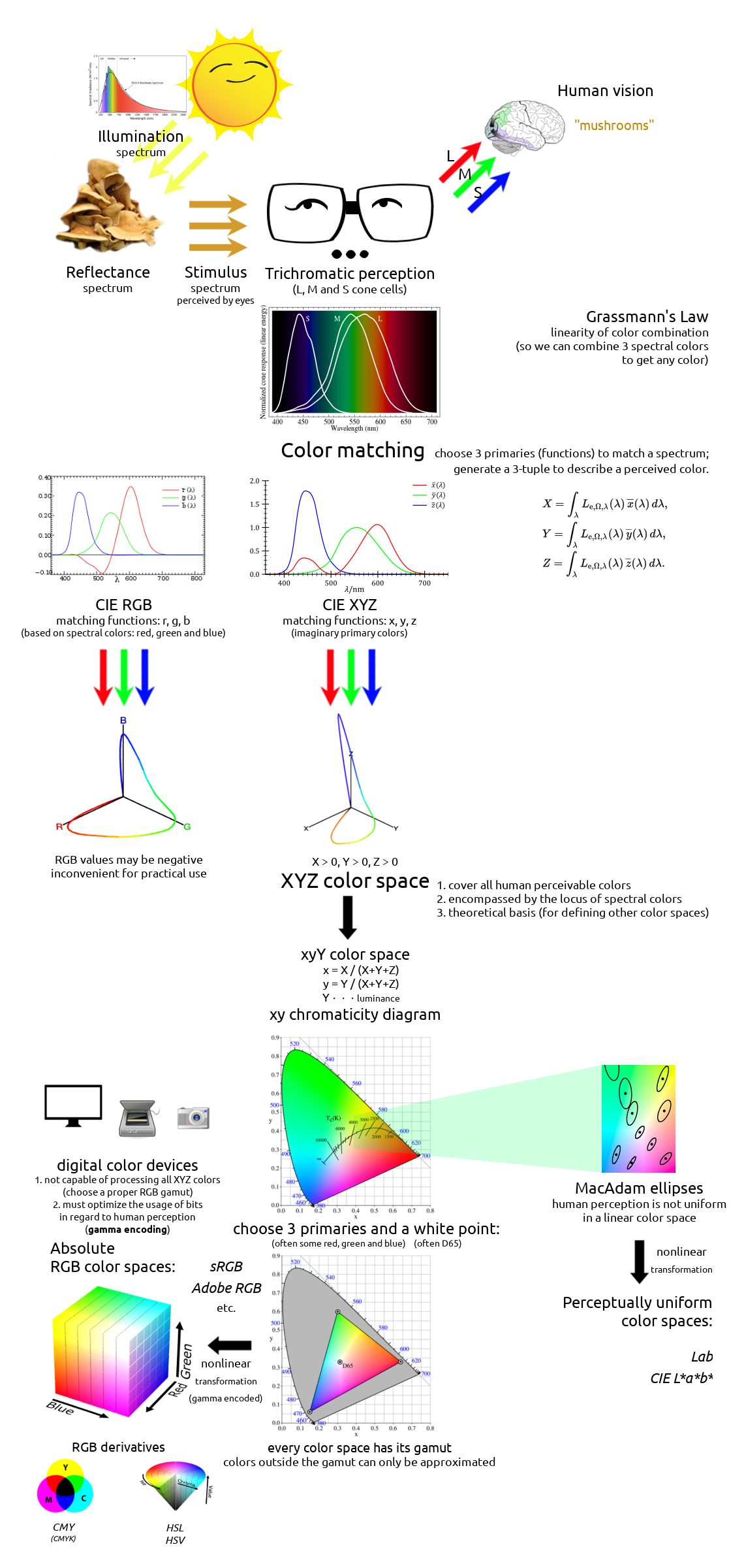
Colors are everywhere. They are an inherent division of human perception, affecting how we see, interpret and interact with the world. Artists, physicists, chemists and biologists have been studying colors over the centuries, for greatly varying interests and profits. But it was not until Isaac Newton firstly decomposed a white light in his prism experiment that people realized the relevancy between solar spectrum and visible colors. Thomas Young and Hermann von Helmholtz proposed the trichromatic theory of human vision, and later in the 19th century, John C. Maxwell’s color matching experiments turned physical colors into quantitative mathematics. In 1931, people defined the first theoretical color space, XYZ, that shows the mathematical link between spectra of lights and human perceivable colors. Since then, numerous color spaces were created for different practical purposes, and they are used by today’s computers, televisions, cameras, printers, and whatever devices that may deal with colors. Although end-users need not know how multiple RGB color spaces can differ or what a gamut is to use a modern digital device, understanding the basics of color theory is essential to any programmer or designer who wants to treat their colors seriously. With some mastery of colors, one would know how to render a fancy scene as a game developer, to analyze a colorful pattern as a data scientist, or to edit a good-looking photo as a photographer; moreover, the management and manipulation of colors can find their use in many more artistic, scientific and industrial fields nowadays.
1 Color Vision and Trichromacy
It is a well-known fact that human eyes’ perception of colors is nothing but stimuli raised by different wavelengths of lights. Our high-level vision, which involves further the brain that is responsible for interpreting things, such as “this red-colored shape is an object” or “this red object is an apple”, can certainly tell more than what bare eyes see. Still, the ability to perceive and recognize colors plays a very fundamental part in a vision system, no matter if it’s a natural or a bionic one.
We are able to perceive a color because either:
- We are looking at something that is a source of light, i.e., an illuminant; or
- We are looking at something that reflects light, i.e., has its reflectance.
An ideal illuminant that reflects no light thus falls perfectly into the first category is also called a black body radiator in physics. It is of theoretical importance in astronomy, though, in our daily life, we perceive earthy things because they reflect lights from existing illuminants in the environment (e.g., the Sun, a light bulb), more than because they emit lights themselves. Therefore, our perceived stimulus from an (non-illuminant) object is mainly determined by two factors:
- Illumination on the object.
- Reflectance of the object surface.
If an object does not emit any lights by itself, it can only reflect lights that already existed in the illumination. Moreover, it does not alter the wavelengths of lights, but only absorbs some wavelengths while letting others reflect, i.e., reducing some light intensities. So, it all comes down to what wavelengths of lights an illuminant emits, as well as what wavelengths an object absorbs (or oppositely, reflects).
The Sun, often approximated as a black-body light source, is the dominant illuminant on the Earth. In physicists’ terminology, it is said to have a color temperature of about 5780 K which makes its light nearly white, though it may appear more or less “warmer” or “redder” as it passes through the atmosphere before going into our eyes. In practical applications, it is sometimes convenient to specify a slightly different color temperature (e.g., 6500 K), when the daylight is considered as the “standard white color” or so-called reference white.
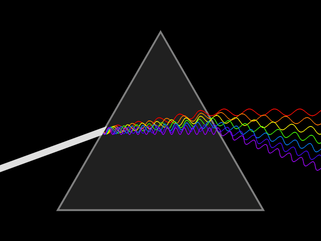
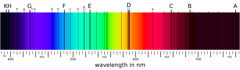
In spite of its white color, from a long time ago, people know that sunlight is not a single wavelength of light. In 1666, Isaac Newton showed that a ray of white sunlight is composed of a continuous spectrum of lights (among them he identified the colors red, orange, yellow, green, blue, indigo, and violet), using a device called dispersive prism. Every nameable color on the spectrum, including human-invisible ones that fall beyond red (infrared) or violet (ultraviolet), corresponds to a specific range of wavelengths. These colors are also called pure spectral colors, due to the fact that they can be found on the solar spectrum and reproduced by light of a single wavelength, i.e., without mixing different spans of wavelengths.
| Spectral color | Wavelength range |
|---|---|
| Violet | 380–450 nm |
| Blue | 450–495 nm |
| Green | 495–570 nm |
| Yellow | 570–590 nm |
| Orange | 590–620 nm |
| Red | 620–750 nm |
Why are we able to discriminate between these different colors, say, red and green? Thinking of eyes as a digital camera, then there must be some sensors (or receptors, in biological terms) that receive all the external light stimuli and produce responses that can be transmitted to and processed by the brain. These sensors are properly named as photoreceptor cells, which lie on the human retina. There are two types of such cells: cone cells and rod cells. Rod cells are mostly responsible for night vision since they appear to be more sensitive under dim lights, while cone cells are those that form the basis for our daily color vision. (That explains why our eyes can see more colors under better illuminations, but not contrarily.)
If human eyes have only one kind of cone cells, the world we see would not be as colorful as it appears for most of us. Cone cells are not precisely made sensors like camera parts, and they certainly can’t measure the wavelength of a light in terms of nanometers. What it does is to get stimulated by light and to convert the stimulus strength into neutral signals. Not too surprisingly, if all cones function the same and give the same responses for a certain wavelength, one would be able to perceive only one color (monochromatic vision). Animals like whales, dolphins and seals are known to be monochromats, while very rare people with genetically flawed vision (“achromatopsia”), are monochromats too.
With one more type of cone cells, visions appear to be very different. For a mixture of different wavelengths of lights that fall into a small area on the retina, if one cone cell is more sensitive in a specific range of light wavelengths while another has a differently sensitive range, the response that they jointly generate could carry more information about the light (recall that colors are merely perceivable strengths of stimuli to our eyes, rather than quantitatively measurable light wavelengths), thus a more vivid picture is perceived by eyes. With two types of cone cells one would have a dichromatic vision. Most placental mammals are dichromats, and colorblind people are usually found to be dichromats too.

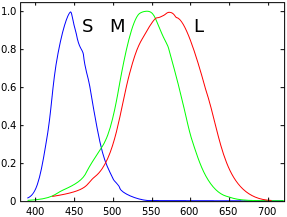
Although evolutionary biology has not yet given a convincing explanation to this, the average human vision is trichromatic, as discovered by Thomas Young and Hermann von Helmholtz in the 19th century. That is, human eyes have three types of cone cells: L cones which are most sensitive to long wavelength lights (red-like), M cones which are most sensitive to middle wavelength lights (green-like), and S cones which are most sensitive to short wavelength lights (blue-like). Although our three types of cells are not specifically responsible for these physical colors, they are often misattributed as “red, green and blue” cone cells. Indeed, if one’s L or M cones are flawed and have similar sensitivities over a range of wavelengths, one could hardly be able to distinguish between red and green. Clearly, the ability for our brain to discriminate colors depends on the responses of all these types of cone cells, whose combination is assumed to be unique for each “color” that we should tell apart from others.

(Photo by: Mort Yao. 2014, Kalmar.)
Again, although we do not know how evolution did the magic trick to sharpen creatures’ color visions, many animals have more than three types of cone cells. Most birds, fishes and insects have tetrachromatic visions (4 types of cones) while pigeons and butterflies are believed to be pentachromats (5 types of cones). The world they perceive must be very different, more colorful than we could ever imagine. We will not go further into multi-chromatic visions beyond trichromacy though, since our eyes are not that good and currently digital visions are mainly a practical imitation of human eyes.
2 Metamers and Color Matching
In real-world visions, a perceived color is often a mixture of different wavelengths of lights (on the spectrum) rather than just a single pure wavelength. Although our trichromatic eyes do a fair job on discriminating pure spectral colors that are emitted by an illuminant (e.g., when seeing a rainbow), they are imperfect for discriminating mixed lights, which consist of a spectral power distribution (SPD) of a variety of light wavelengths. Quite often, different spectral distributions may be perceived as identical colors, and we would not be able to tell them apart by our eyes until we measure their actual spectra using an external device. Such two colors with different spectral distributions but appear alike to our vision are called metamers. This phenomenon of metamerism is a consequence of color matching, as suggested by the mathematical model of color perception.
Given the spectral power distribution of a light that reaches the retina, our eyes don’t see its histogram at all. Instead, three types of cone cells jointly generate a tuple of three numbers \((\rho, \gamma, \beta)\) as the tristimulus response. That is what we really perceive when “seeing” a color. Let \(L_e(\lambda)\) be the intensity function for a wavelength \(\lambda\) of the given spectral distribution, \(\bar\rho(\lambda)\), \(\bar\gamma(\lambda)\) and \(\bar\beta(\lambda)\) be sensitivity functions of three types of cone cells. Then the 3-tuple response can be computed by integrating the products of wavelength intensity and cone sensitivity over the whole visible spectrum:
\[\rho = \int_{\lambda_\text{v}}^{\lambda_\text{r}} L_e(\lambda) \bar\rho(\lambda) d \lambda\] \[\gamma = \int_{\lambda_\text{v}}^{\lambda_\text{r}} L_e(\lambda) \bar\gamma(\lambda) d \lambda\] \[\beta = \int_{\lambda_\text{v}}^{\lambda_\text{r}} L_e(\lambda) \bar\beta(\lambda) d \lambda\] \[(\lambda_\text{v} \doteq 380 \text{nm}, \lambda_\text{r} \doteq 780 \text{nm})\]
Obviously, if two spectral distributions yield the same tuple \((\rho, \gamma, \beta)\), we would not be able to discriminate them as their colors appear alike to our eyes. That is to say, our color perception does not depend on the direct discrimination of spectral power distributions \(L_e\), but it’s determined by the simpler 3-tuple response generated from cone cells, which in turn depends on the light \(L_e\) and three sensitivity functions \(\bar\rho\), \(\bar\gamma\) and \(\bar\beta\).
On the other hand, given a light as stimulus to our eyes, although we cannot tell its spectral power distribution, it is desirable to have an objective, unambiguous description of what color it is. This is possible as long as the tristimulus value \((\rho, \gamma, \beta)\) uniquely determines a visible color. So far, we have yet to find three sensitivity functions \(\bar\rho\), \(\bar\gamma\) and \(\bar\beta\), also called color matching functions, for our perception model. Once we fixed \(\bar\rho\), \(\bar\gamma\) and \(\bar\beta\), the tuple \((\rho, \gamma, \beta)\) is just the quantitative description of a visible color.
Naturally, we may attempt to measure the sensitivities of L, M and S cone cells under the full spectrum, and reconstruct these sensitivity functions as color matching functions we want. The major problem is that performing a measurement on separate types of cone cells was technically impossible in the early days (in fact, people do not even have any experimental evidence of trichromatic theory until 1950s); furthermore, as these color matching functions are based on the internal properties of biological organs rather than external lights we can observe and compare, such a physiological method would be counter-intuitive and statistically inconsistent. Therefore, the first historical approaches (and most widely used approaches as of today) of describing colors are not based on the actual sensitivities of cone cells; however, three color matching functions are still required as trichromatic vision is assumed.
In 1850s, James Clerk Maxwell carried out a color matching experiment: Given a patch of light with a certain visible spectral color (called the target color), the observer is asked to adjust the intensities of three single-wavelength source lights; the goal is to make their composite visually match the target color, that is, this reproduction must be a metamer of the target color. Each of the three source lights has a fixed wavelength, roughly corresponding to what we call primary colors (or primaries) today: red, green and blue. When we get the exact match for target light of wavelength \(\lambda\), we record the intensities of red, green and blue source lights \((\bar r(\lambda), \bar g(\lambda), \bar b(\lambda))\). It is immediately clear that we can construct three color matching functions \(\bar r\), \(\bar g\) and \(\bar b\) this way, and use them as a basis for describing any spectral color.
Although the idea may look appealing and straightforward, in fact it won’t work most of the time, until we cheat a little bit! The matter is that if we are allowed only to add three source lights of primaries, we will not be able to reproduce many pure spectral colors. In such cases, we must allow to add some extra light to the target to achieve the exact match we want; this light is said to have a negative intensity. Of course, nothing will ever emit a “negative light” in reality, so this is just a simple mathematical trick we play here. Thus the intensity curves are allowed to fall below the horizontal axis when the required value is negative. Given all three color matching functions we measured, we may now describe any visible color using a unique tuple \((R, G, B)\).
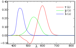
So far, we have dealt with pure spectral colors on a spectrum: When observing a pure spectral color of wavelength \(\lambda_0\), let \(S(\lambda)\) be the normalized spectral power distribution, which is essentially a delta function \[S(\lambda) = \begin{cases} +\infty, & \lambda = \lambda_0 \\ 0, & \lambda \ne \lambda_0 \end{cases}\] with \(\int_{-\infty}^{+\infty} S(\lambda) d\lambda = 1\), then we have \(R = \int_{\lambda_\text{v}}^{\lambda_\text{r}} S(\lambda) \bar r(\lambda) d \lambda = \bar r(\lambda_0)\); analogously we get \(G\) and \(B\). Thus, \((R, G, B) = (\bar r(\lambda_0), \bar g(\lambda_0), \bar b(\lambda_0))\) is the description of a spectral color. But what about impure colors, i.e., colors that consist of multiple wavelengths of spectral lights?
To expand our approach of color description from pure spectral colors to all colors, there is an intuitive way, using the same set of color matching functions. For example, assume that an observed color is composed of 80% intensity of light with wavelength \(\lambda_1\), and 20% intensity of light with wavelength \(\lambda_2\). If we can divide it into two separate lights, then both of them are pure spectral colors that we can find on our curves. Let the color of the first light be \[(R_1, G_1, B_1) = (\bar r(\lambda_1), \bar g(\lambda_1), \bar b(\lambda_1))\] and the second light be \[(R_2, G_2, B_2) = (\bar r(\lambda_2), \bar g(\lambda_2), \bar b(\lambda_2))\] Then it would be natural to think that \((R, G, B)\), where \[R = 0.8 R_1 + 0.2 R_2\] \[G = 0.8 G_1 + 0.2 G_2\] \[B = 0.8 B_1 + 0.2 B_2\] is the description of the observed color.
Why is this intuition correct? Well, we cannot prove it since we use the tristimulus values \(R, G\) and \(B\) solely for the purpose of describing colors in our perception model, and we don’t know what a “correct” color description would be until we have the 3-tuple \((R, G, B)\). The absolute values of \(R, G\) and \(B\) do not really matter as long as each combination of them uniquely describes a visible color, and it seems we have no reason to make things overly complicated for ourselves. Thus, the linear combination of different spectral light colors is almost always assumed, at least when we describe a color using these color matching functions. This empirical result was proposed by Hermann Grassmann in 1853, so it’s also known as the Grassmann’s law. By this result, we know that not only pure spectral colors can be matched by three primaries (as in Maxwell’s experiment), but also every arbitrary color can be matched and described in a unique way. Thus, the following definition of colors using (experimentally obtainable) color matching functions \(\bar r\), \(\bar g\) and \(\bar b\), is now justified:
Definition 1. The tristimulus color of a light with spectral power distribution \(S(\lambda)\) is a 3-tuple \((R, G, B)\): \[R = \int_0^{+\infty} S(\lambda) \bar r(\lambda) d \lambda\] \[G = \int_0^{+\infty} S(\lambda) \bar g(\lambda) d \lambda\] \[B = \int_0^{+\infty} S(\lambda) \bar b(\lambda) d \lambda\] where \(\bar r(\lambda), \bar g(\lambda), \bar b(\lambda)\) are predefined color matching functions.
As defined above, the 3-tuple of \((R, G, B)\) uniquely determines a visible color, but the underlying spectral distribution \(S(\lambda)\) can vary a lot in metamers of the same color. To describe a color in the scope of trichromatic vision, having the tristimulus value would be sufficient; however, this might not be enough if we are going to produce a color, e.g., a pigment for color painting. As the spectral power distribution \(S(\lambda)\) depends on both the illumination and the reflectance spectrum of the surface, the observed color \((R, G, B)\) may change if the illumination changes.

In industry, it is often desirable that two metamers have consistent color identity, that is, if two paints appear as the same color under one illumination, then they should still appear as the same color under whatever other illuminations. A simple tristimulus (metameric) color match \((R_1, G_1, B_1) = (R_2, G_2, B_2)\) cannot guarantee that property, and spectral color match is required so that a paint does not only appear as a specified color \((R, G, B)\) in some illumination, but also has a specified reflectance spectrum which preserves its color consistency under any illumination.
3 XYZ Color Space
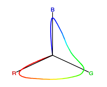
We have used three primary colors (red, green and blue) to construct our three color matching functions. The approach is physically natural, since we know that these colors are real, purely spectral and can be generated by single wavelengths of lights. There is one annoying problem with it, though: Since the codomains of color matching functions are allowed to have negative values, we may have a color description where one or more of \(R, G, B\) are negative; hence it is hard to tell whether a color description \((R, G, B)\) makes sense, i.e., denotes a real color that can be produced by a certain spectral distribution \(S(\lambda)\) using color matching functions \(\bar r(\lambda)\), \(\bar g(\lambda)\) and \(\bar b(\lambda)\).
For mathematical convenience, it would be nice if for every meaningful color \((R, G, B)\), we have \(R \geq 0, G \geq 0, B \geq 0\). However, this is not possible if we just use three pure spectral colors as primaries to construct our matching functions. Using \(R\), \(G\) and \(B\) as coordinates to draw the 3-dimensional color space, you will find that all visible colors spread into four octants (+++, ++-, +-+, -++), while one would expect that every color falls into only the first octant (+++).
In 1931, the International Commission on Illumination (CIE) defined a standard set of color matching functions, \(\bar x(\lambda)\), \(\bar y(\lambda)\) and \(\bar z(\lambda)\); unlike \(\bar r(\lambda)\), \(\bar g(\lambda)\) and \(\bar b(\lambda)\), their values are always non-negative. Moreover, as the tristimulus values depend on the observer’s field of view, a standard observer has been specified to represent an average human cone’s response within a 2° arc inside the fovea. The resulting color space is referred to as the CIE 1931 XYZ color space, or simply XYZ. CIE 1931 XYZ and its later revision CIE 1964 XYZ (which uses a 10°-arc standard observer) are widely accepted as a scientific and industrial standard of color specification as of today, due to their ease of mathematical handling (every meaningful color satisfies \(X > 0\), \(Y > 0\) and \(Z > 0\)) and that they do not appeal to any specific choice of three primary colors.
For a 10°-arc standard observer, as specified by the CIE 1964 XYZ color space, the color matching functions are directly derived from \(\bar r_{10}(\lambda)\), \(\bar g_{10}(\lambda)\) and \(\bar b_{10}(\lambda)\). \[\bar x_{10}(\lambda) = 0.341 \bar r_{10}(\lambda) + 0.189 \bar g_{10}(\lambda) + 0.388 \bar b_{10}(\lambda)\] \[\bar y_{10}(\lambda) = 0.139 \bar r_{10}(\lambda) + 0.837 \bar g_{10}(\lambda) + 0.073 \bar b_{10}(\lambda)\] \[\bar z_{10}(\lambda) = 0.000 \bar r_{10}(\lambda) + 0.040 \bar g_{10}(\lambda) + 2.026 \bar b_{10}(\lambda)\]
Definition 2. The tristimulus color of a light with spectral power distribution \(S(\lambda)\) is a 3-tuple \((X, Y, Z)\): \[X = \int_0^{+\infty} S(\lambda) \bar x_{10}(\lambda) d \lambda\] \[Y = \int_0^{+\infty} S(\lambda) \bar y_{10}(\lambda) d \lambda\] \[Z = \int_0^{+\infty} S(\lambda) \bar z_{10}(\lambda) d \lambda\]
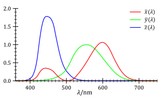
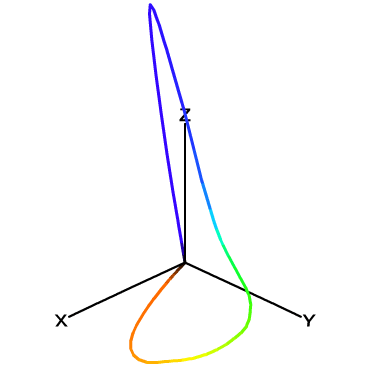
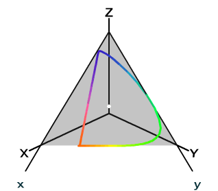
Note that XYZ is still a linear color space that conforms to Grassmann’s law, since its three color matching functions \(\bar x_{10}\), \(\bar y_{10}\) and \(\bar z_{10}\) are just linear combinations of \(\bar r\), \(\bar g\) and \(\bar b\). Now that these color matching functions yield only non-negative values, we can tell that all visible colors must lie in the first octant (+++), as shown in Figure 11.
It is worth mentioning that unlike the 3-D diagram of \((R, G, B)\) colors (Figure 9), the locus of pure spectral colors does not pass across the three axes \(X\), \(Y\) or \(Z\) anymore (except for the origin \(O\)). This is an expected result since we don’t want any color to take negative coordinates. Thus, the \(X\), \(Y\) and \(Z\) unit vectors no longer correspond to any real colors we can observe. In other words, \((1, 0, 0)\), \((0, 1, 0)\) and \((0, 0, 1)\), while they are mathematically valid in this space, are not really “colors” since they cannot be generated by any combinations of spectral colors. Allowing for non-existing colors seems a bit oddity here, but the most important thing is that this XYZ color space does cover every color our trichromatic vision can perceive, so it is at least a complete treatment suitable for theoretical use whenever we want to describe any color.
4 Luminance and Chrominance
In Section 1, we know that our color perception of an object depends on the illumination and the reflectance of its surface. In Section 2 and 3, we proposed two approaches, RGB and XYZ, to mathematically describe a color perceived by our trichromatic vision. However, it is not clear yet how we could separate the factor of illumination from other factors in our color spaces; in reality, we can intuitively tell the coloring effect the luminous intensity of a light has, but both \((X, Y, Z)\) and \((R, G, B)\) fail to split out the aspects of light intensity (called the luminance) and “the essence of color” (called the chrominance) that we may need to measure and manipulate individually, in many kinds of applications.

To address the issue, we can keep one of three tristimulus values as an indication of luminance, and normalize two of them since their absolute values no longer matter thus their relative values can be dedicated to represent the chrominance. For \((R, G, B)\), it is empirically optimal to keep \(G\) as the indication of luminance, normalize \(R\) and \(G\) and throw away \(B\), since our trichromatic cone cells are least sensitive to bluish colors, but whatever our choice is, we will not lose any information about a color. The following transformation yields the new tuple \((r, g, G)\), which may be as well used as a way of color description: \[r = \frac{R}{R + G + B}\] \[g = \frac{G}{R + G + B}\] \[G = G\]
Clearly this transformation is reversible, since we have \(R = \frac{G}{g} r\), \(B = \frac{G}{g} (1 - r - g)\).
Now that we have \(G\) for the luminance, the 2-tuple \((r, g)\) can be used as a representation of chrominance. This gives us the 2-dimensional rg chromaticity plane, which is a subspace of the 3-dimensional RGB color space. We can let \(b = \frac{B}{R + G + B}\) thus cut the RGB color space with the plane \(r + g + b = 1\). Then every visible color can be projected to this plane, discarding its luminance and preserving its chrominance information \((r, g)\) only.
For the XYZ color space, we can do the analogous trick to lift out the chrominance from the tuple \((X, Y, Z)\) representing a color. Represent a color as \((x, y, Y)\), where \[x = \frac{X}{X + Y + Z}\] \[y = \frac{Y}{X + Y + Z}\] \[Y = Y\]
This transformation is reversible since \(X = \frac{Y}{y} x\), \(Z = \frac{Y}{y} (1 - x - y)\).
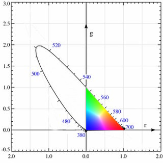
Let \(z = \frac{Z}{X + Y + Z}\) and cut the XYZ color space with the plane \(x + y + z = 1\). The 2-tuple \((x, y)\) can be used to specify the chrominance of a color uniquely. In this 2-dimensional diagram of the xy chromaticity plane, we have that for every meaningful color, \(x > 0\) and \(y > 0\).
5 RGB Color Spaces and Gamuts
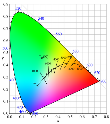
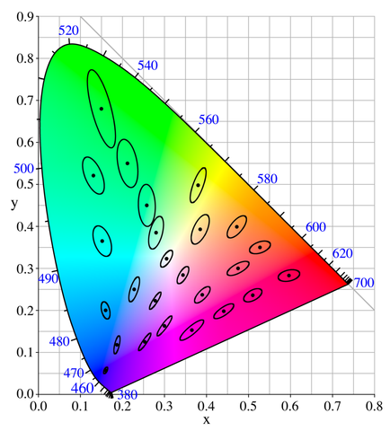
There are some interesting inherent facts about the chromaticity diagram. First, due to the linearity of the XYZ color space (therefore also the xy chromaticity plane), given any two points representing two visible colors in the diagram, the straight line that connects them has all the chromaticity values that can be produced when mixing these two colors. Second, due to the linearity again, given three points representing three visible colors, the triangle formed by them covers all the chromaticity values that can be produced when mixing these colors. Given the projection of the locus of pure spectral colors, the area encircled by it is exactly the chromaticity values of all perceivable colors, as colored in Figure 16.
Natural lights are mixtures of spectral colors, and they are well shown in this diagram as expected. Consider a black body radiator (i.e., a perfect illuminant) with continuously increasing color temperatures, its locus (called the Planckian locus) goes from the “redder” part to a “bluer” part, roughly passing through the centrally located white point \((x, y) = \left(\frac{1}{3}, \frac{1}{3}\right)\) in the diagram. A black body radiator with color temperature 6500 K emits a purely white light; this is important for us because it gives us a precise way to specify how “white” is a white, and we will need this reference in many kinds of real-world uses.
The linearity of this chromaticity diagram suggests an alternative, more practical way of specifying colors. Fix three primary colors in the diagram, then we can effectively generate all colors that fall in the triangle they form. By inspecting the shape of the spectral locus in the chromaticity diagram, our intuition tells us that if we choose a red, a green and a blue point as primaries, the resulting triangle would have a larger area so that it is capable of representing more perceivable colors. The choice of these primary colors yields many variants of RGB color spaces that are widely used today (e.g., sRGB, scRGB, Adobe RGB). Note that these color spaces are not the same as the CIE RGB color space we have seen in Section 2: In the CIE RGB color space, we are required to fix three wavelengths of spectral lights as primaries; Now we are allowed to use any three points in the chromaticity diagram as primaries, whether they are purely spectral (i.e., on the locus curve) or not. A more beneficial difference is that now we can really generate any color in the triangle using corresponding primaries, without appealing to the mathematical trick that allows for adding lights to the target as “negative” \(R\), \(G\), \(B\) tristimulus values. Practically, when we use a physical device (e.g., an LCD screen) to generate a color, the primary color lights are always mixed in an additive way and we can never “erase” some value from our cone cells that perceive colors.
We might have been told that three additive colors (red, green, blue) are capable of generating every color; now we can see that it’s only part of the truth. Because the locus of spectral colors is curved in the xy chromaticity diagram, no choice of three primaries can cover all spectral colors. The area in the triangle of primary colors is called the gamut of the corresponding color space. Due to technical limitations, many color displaying devices do not yield pure spectral colors, so the primary colors are often chosen inside the spectral locus area rather than on the locus curve, thus practical RGB color spaces can have much smaller gamuts than all perceivable colors in the XYZ color space.
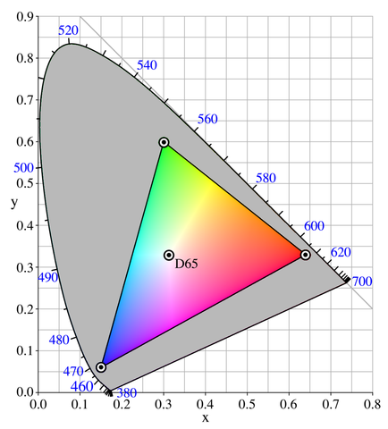
To give a unique color specification in the triangular RGB gamut, it is not sufficient to have only three primary color points. Here’s some informal mathematics: In CIE RGB and XYZ color spaces, as well as in their corresponding rg and xy chromaticity planes, the standard bases are clear by their definitions of 3 or 2 coordinates. This time we will need our own set of unit color vectors to make an RGB color space Euclidean. To convert our chosen red, green and blue vertices into unit vectors, it is essential to have a “reference point” \((1,1,1)\), so that we can define the unit red as \((1,0,0)\), the unit green as \((0,1,0)\), and the unit blue as \((0,0,1)\), thus describe any color using these vectors.
Theoretically, this reference point should be located at \(\left(\frac{1}{3}, \frac{1}{3}\right)\) in the xy chromaticity diagram, so that we have \(z = 1 - x - y = \frac{1}{3}\) and the corresponding \((X, Y, Z)\) has the nice property that \(X = Y = Z\). In practice, we want to use a more physically reproducible light as the reference, so a black body radiator with color temperature 6500 K would be ideal since it resembles the color of an average white daylight, as we mentioned before. This reference white point is located at \((x, y) = (0.31271, 0.32902)\) (by CIE 1931 XYZ 2° standard observer) as shown by experiments. An ideal illuminant that emits this white light (with a color temperature of 6500 K) is referred to as the Illuminant D65 by CIE standards.
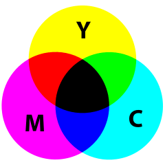
Now that we have the reference white point as \((1,1,1)\) in our new RGB color space, it is clear how to construct three unit vectors we want. The triangular RGB gamut in the chromaticity diagram represents a color subspace if we add luminance to it, and we transform this to an Euclidean space using predefined unit red, green and blue vectors as the standard basis. The resulting space is often called an RGB cube, in the sense that every color in the gamut falls into this \(1\times 1\times 1\) cubic space. Then it is just common knowledge that while \((1,0,0)\) is red, \((0,1,0)\) is green, \((0,0,1)\) is blue, the other vertices are \((1,1,0)\) which yields yellow as a mixture of red and green, \((0,1,1)\) which yields cyan as a mixture of green and blue, \((1,0,1)\) which yields magenta as a mixture of blue and red, and \((1,1,1)\) which is just the reference white.
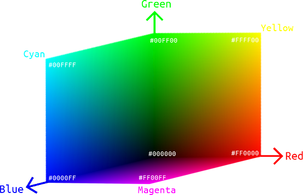
Given the gamut of a color space, the RGB cube is an intuitive representation of all the colors it covers. Many physical devices use the combination of red, green and blue pixels to display colors, so RGB color spaces are of great engineering importance in representing actual colors that can be generated on a device, while the aforementioned CIE XYZ color space is a theoretical, complete treatment of all human perceivable colors.
So far, all the color spaces we dealt with are mathematically continuous. Specifically for our RGB cube, there is an infinite number of tuples \((R, G, B)\) such that \(0 \leq R \leq 1\), \(0 \leq G \leq 1\), and \(0 \leq B \leq 1\). Two problems arise: 1. Can our eyes discriminate an infinite number of colors? 2. How can we store a color specification in the computer?
The good news is that the answer to our first question is no, since no biological receptor can have an infinitely precise sensitivity (the very experimental result was shown by David MacAdam in 1940s). Therefore, for the second question, we can use a reasonable number of bits to achieve the best color precision that our eyes can appreciate. More formally, consider a color \((R,G,B)\), we know that there exist \(\varepsilon_r > 0\), \(\varepsilon_g > 0\) and \(\varepsilon_b > 0\) such that \((R', G', B')\) (where \(|R'-R| < \varepsilon_r\), \(|G'-G| < \varepsilon_g\), and \(|B'-B| < \varepsilon_b\)) and \((R,G,B)\) appear indistinguishably to our eyes.
In the old days, people use 8 bits (3 bits for \(R\), 3 bits for \(G\), and 2 bits for \(B\)) to store a color on computers, enabling 256 colors in total. Modern-day software uses 24-bit color depth, also called the true color, where each of \(R\), \(G\) and \(B\) is stored in 8 bits (i.e., 1 byte). The total number of representable colors is \(\left(2^8\right)^3 = 16,777,216\), and that has exceeded the number of colors an average eye can discriminate. To avoid floating-point errors, we often consider the values of \(R\), \(G\) and \(B\) unsigned 8-bit integers, so their ranges are expanded to \([0,255]\) instead of \([0,1]\). In web design and photo editing programs, it is also conventional to write the 3-tuple \((R,G,B)\) as a concatenated hexadecimal string, e.g., \((255,128,0)\) as #FF8000.
It should be noted that the precision of color representation (color depth) is not the only factor that affects the color quality of a device. While increasing the number of bits can, in theory, provide a more accurate color description, a color professional would also prefer using an RGB color space with a wider gamut, e.g., Adobe RGB over sRGB.
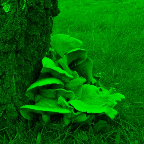
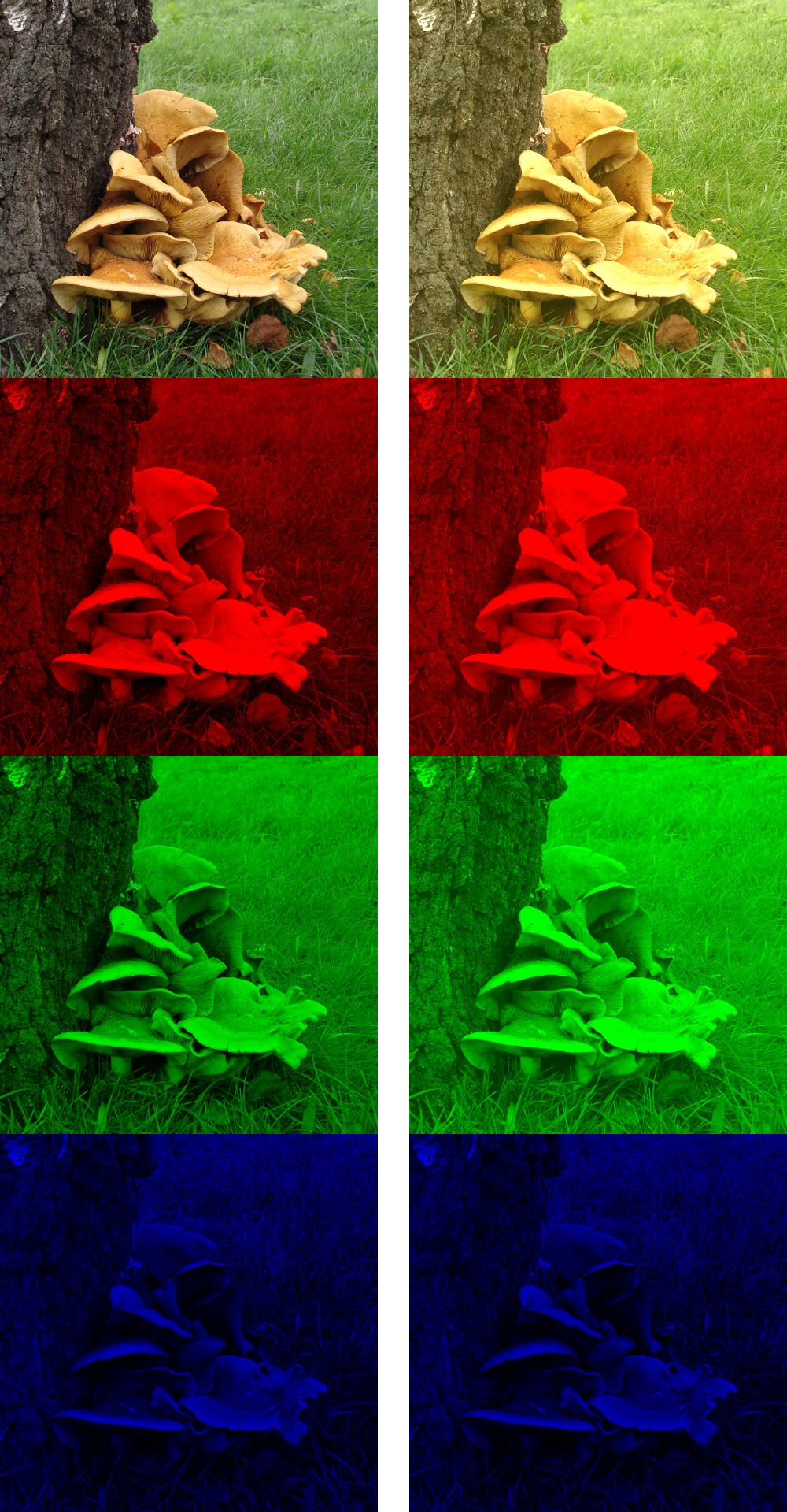
RGB color spaces are not only useful in producing colors on a physical device; they also play a great role in digital photography, graphic design, computer vision as well as every other application area where image processing is needed. We can take apart \(R\), \(G\), \(B\) components from a picture and manipulate them in our desired way, as shown by the example in Figure 20.
RGB also forms the basis for many other useful color spaces. By looking at an RGB cube, one might wonder if it’s feasible to use the other 3 vertices, namely cyan, magenta, and yellow, to specify any RGB color. This is possible as long as we allow some subtractive color generation: Given that the vector of cyan is \((0,1,1)\), the vector of yellow is \((1,1,0)\), and we want to generate the color green \((0,1,0)\). Actually, this is how things work in color reflectance: If a pigment absorbs all wavelengths of lights that correspond to color red, it appears as cyan; if another pigment absorbs all wavelengths of lights that correspond to color blue, it appears as yellow. Mixing these pigments together, all wavelengths of lights that correspond to color red and blue are all absorbed, thus the mixture will appear as green only. Indeed, we use the subtractive color space (with cyan, magenta and yellow as primaries) in color printing, and it is called the CMYK color space (where K represents blacK). In theory we could just use the mixture of cyan, magenta and yellow pigments to print any color, but for some technical reasons, we need an extra black pigment aside from three primaries:
- Pigments are never ideal, especially for that they are printed to a paper, whose reflectance can significantly affect the quality of color printing. The mixture of three primaries actually yields some gray instead of black.
- Black is so common in printing, and using a black pigment whenever possible instead of mixing three expensive color pigments would be a big saving.
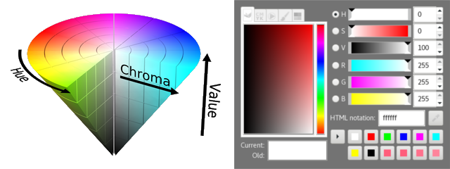
Many other commonly seen derivatives of the RGB model are defined by coordinate transformations of an RGB color space. By looking at the RGB cube again, we may notice that the line connecting black \((0,0,0)\) and white \((1,1,1)\) contains all the grayscale (“colorless”) colors, thus this vector can be used to indicate the lightness (or value, intensity) property of a color; then we can choose two more linearly independent vectors to determine a point in the relative RGB space. Commonly a polar coordinate system is used, with the radius called the saturation (or chroma) and the polar angle called the hue of a color. Two of these cylindrical-coordinate color spaces are HSL and HSV; in image editing programs, they are often used in GUI color selection tools together with their equivalent RGB values, as they intend to provide an intuitive way of adjusting the tints and shades of a color, which is obscure to do if using RGB directly.
6 Gamma Encoding
So far, we have covered the theoretical basics of a linear RGB color space. By choosing the proper gamut (which is formed by three primaries) and a reference white point (which is usually D65) from the XYZ space, we can simply do a linear transformation and construct an absolute RGB color space and its derivatives (e.g., CMYK or HSV) for many practical uses, specifying colors that we can display on a screen or print somewhere. However, digitalization isn’t without costs. Given a limited number of bits for storing colors, we would like them to be utilized most efficiently, that is, to have a gamut and precision that look optimal to our eyes. But such an information-theoretic optimality suffers under a linear color space, since human vision does not perceive all colors uniformly (as shown by Stevens’s power law), and encoding all colors linearly will be wasting bits on distinguishing higher-intensity colors that our eyes don’t really see the difference, while spending not enough bits on distinguishing lower-intensity colors that our eyes are more sensitive and sharp to discriminate.

Right: a gradient of reds gamma-encoded using the same number of bits, with power-law nonlinearly ascending intensities.
Clearly, the right encoding method would provide better color quality for an average image.
Recall that in Figure 19, MacAdam ellipses have visually shown that our ability to discriminate different chrominances of colors is not uniform. The same phenomenon is found on discriminating luminances. The Left color map in Figure 23 demonstrates this issue with linear RGB color spaces. To see the problem, we used 3 bits to store different intensity levels of reds. If these ascending intensities are linearly encoded, then the colors of 111 and 110 would be hardly distinguishable to an average eye, similarly for the colors of 110 and 101, 101 and 100; our perception is less sensitive to intensity changes at a higher range. On the other hand, the color difference between 000 and 001 is too significant, which is bad since all the colors between them won’t be representable using this 3-bit encoding, even though we are wasting the information entropies of 100, 101, 110 and 111 to refine color differences that we don’t care as much.
Today, most color spaces used in the digital world (e.g., on a computer or in a camera) encode colors in a nonlinear way, referred to as the gamma correction. To encode a color from a linear space to a gamma space, we do a power-law transformation on its intensities: \[V_\text{encoded} = A V_\text{linear}^{1/\gamma} \qquad (\gamma > 1, A \text{ is a constant.})\] where \(V \in [0,1]\) is \(R\), \(G\) or \(B\).
To decode a color back to the linear space, conversely: \[V_\text{linear} = \left(\frac{V_\text{encoded}}{A}\right)^\gamma\]
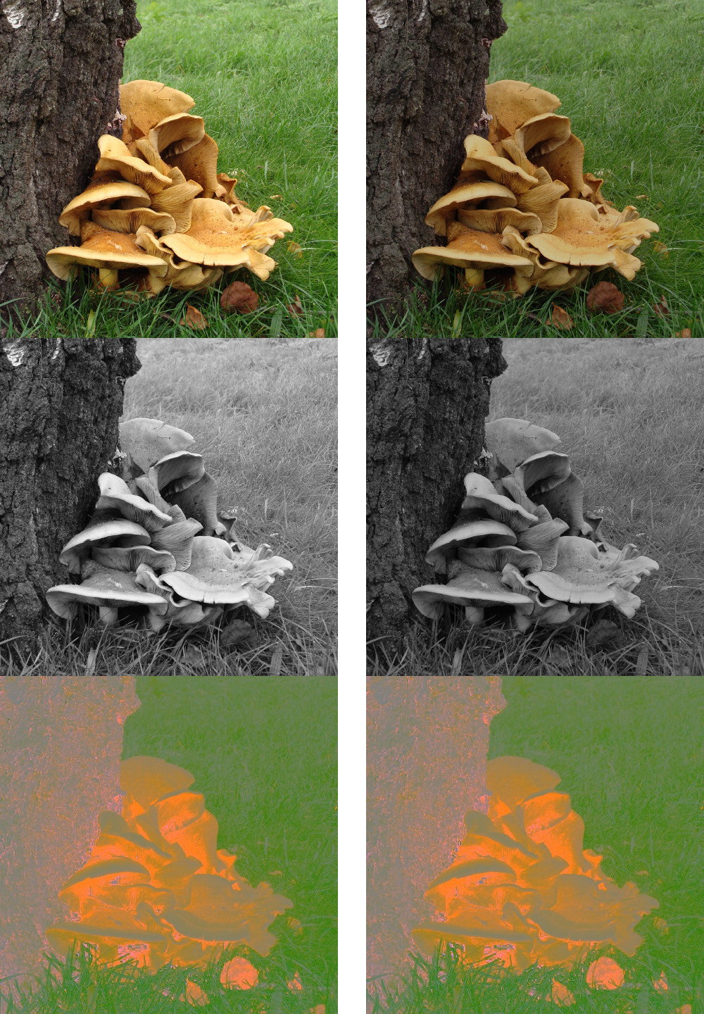
So, what intuitively does this encoding/decoding transformation do? As in Figure 23, we want the Right color map to be used when displaying a stored image, because it yields the best perceptual uniformity; but a Left color map enjoys the nice properties of linearity, which is mathematically convenient when processing an image. Gamma encoding would transform the Right color map to the Left one, using a \(0 < 1/\gamma < 1\), so we can operate on a gamma-encoded image as if it is in a linear space (the Left color map).
To display a gamma-encoded image correctly, gamma decoding would transform the Left color map (linear) back to the Right one (nonlinear but perceptually optimal). The decoding process is also called a gamma correction, and for a gamma-encoded image, if this is not handled correctly (or not performed at all) in the responsible displaying device, the result can appear suboptimal to an end-user.
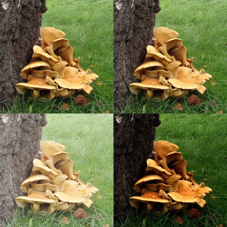
Top-Right: an image gamma-encoded and decoded correctly should look identical to its original;
Bottom-Left: gamma-encoded with \(\gamma=2\) but never decoded; the image looks brighter than it should be, and the mushroom surface and the grass look too plain with a lack of texture contrast;
Bottom-Right: gamma-encoded with \(\gamma=2\), but incorrectly decoded with \(\gamma=4\); the image looks richer in colors, but the shadows of the mushroom and the tree are too dark and their details are hardly seeable.
The dominant RGB color space in use today, sRGB, is a nonlinear color space that makes use of the gamma correction. Formally, it uses the primaries defined in the Rec. 709 standard with the D65 white point. There are more technical details to tell, but the main idea of optimizing bit usage for human color perception is the same as justified above. Nowadays, the Web uses sRGB. LCD monitors use sRGB. Unless you are a hypercritical photographer or a color technician, your digital camera and inkjet printer are most likely to use sRGB too. The other commonly seen Adobe RGB space has a wider gamut covering over 50% of the CIE XYZ space, thus it’s often considered for high-end use by professionals, and it’s also a nonlinear color space with gamma correction. The conversion between sRGB / Adobe RGB and the linear RGB space can be handled by the color management tools of graphics software, therefore is transparent to most end-users. However, if one is going to write a program that displays some graphical scene or processes a raw image from low-level, it is extremely helpful to understand how gamma works on the underhood bits.
7 Recap
8 References
(Further Reading)
- General introduction to human color vision.
- “Wikipedia – Color vision.” https://en.wikipedia.org/wiki/Color_vision
- Color theory: color matching, primaries, and the XYZ color space. (of great theoretical importance!)
- (From Computer Vision perspective) David Forsyth and Jean Ponce. Computer Vision: A Modern Approach.
- (From photographers’ perspective) Stanford course CS 178 – Digital Photography (Spring 2010). https://graphics.stanford.edu/courses/cs178-10/
- “Introduction to color theory.” https://graphics.stanford.edu/courses/cs178-10/applets/locus.html
- “Color I: trichromatic theory.” https://graphics.stanford.edu/courses/cs178-10/lectures/color1-11may10-150dpi-med.pdf
- “Color II: applications in photography.” https://graphics.stanford.edu/courses/cs178-10/lectures/color2-13may10-150dpi-med.pdf
- “Do ‘primary’ colors exist?” http://www.handprint.com/HP/WCL/color6.html
- “Основы теории цвета. Система CIE XYZ.” https://habrahabr.ru/post/209738/
- “Wikipedia – CIE 1931 color space.” https://en.wikipedia.org/wiki/CIE_1931_color_space
- Gamma encoding and correction. (a practical issue on digital systems that process colors)
- “What every coder should know about gamma.” http://blog.johnnovak.net/2016/09/21/what-every-coder-should-know-about-gamma/
- “Understanding gamma correction.” http://www.cambridgeincolour.com/tutorials/gamma-correction.htm
- “Wikipedia – Gamma correction.” https://en.wikipedia.org/wiki/Gamma_correction
- Practical RGB color spaces that utilize gamma correction.
- “Wikipedia – sRGB color space.” https://en.wikipedia.org/wiki/SRGB
- “Wikipedia – Adobe RGB color space.” https://en.wikipedia.org/wiki/Adobe_RGB_color_space